
The importance of a seamless online shopping experience cannot be overstated in today’s digital world. With more people using mobile devices to shop, your eCommerce platform must be able to adapt to different screen sizes and resolutions. Enter SuiteCommerce, an eCommerce solution by NetSuite that offers a fully customizable and responsive design, ensuring a consistent user experience across devices. This blog post will guide you through creating, customizing, and implementing a responsive SuiteCommerce theme, maximizing your online store’s potential, and keeping your customers engaged.
From understanding the importance of responsive design in SuiteCommerce to exploring popular themes and optimizing performance, this comprehensive guide will provide the knowledge and tools needed to successfully launch a responsive SuiteCommerce theme that caters to your target audience, reflects your brand identity, and drives revenue.
Understanding SuiteCommerce and Its Importance
Responsive web design has proven reliable, with many benefits for brands in recent years. It provides a robust foundation for developers to build on and entrepreneurs to launch marketing campaigns to drive revenue and ensure business sustainability.
As the prevalence of mobile devices necessitates a uniform user experience across all platforms and web pages, responsive design is essential. SuiteCommerce, offered by NetSuite, provides a consistent shopping experience across multiple devices, including mobile devices.
What is SuiteCommerce?
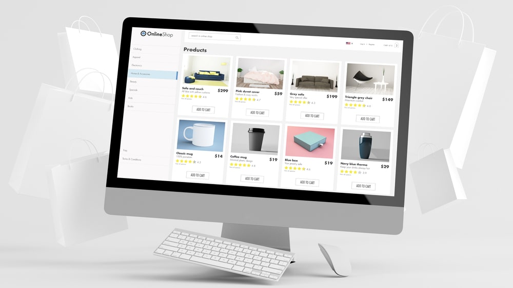
SuiteCommerce is NetSuite’s premier eCommerce solution that is pre-integrated with ERP, offering a unified view of the customer, order, inventory, and other essential business systems, optimized for mobile phones and other devices. This integration ensures a seamless shopping experience, catering to a broad audience across different devices and adapting to various browser window sizes.
A mobile-friendly website offers an optimal user experience, considering even the subtlest details, such as navigation conducive to thumb use, easily accessible buttons and links, large visuals, appropriate font size, and a clutter-free design with fewer features. SuiteCommerce enables businesses to deliver an engaging and consistent shopping experience, regardless of the device used.
Why Choose SuiteCommerce?
SuiteCommerce provides a customizable, responsive design, seamless integration with NetSuite, and a scalable solution suitable for businesses of all sizes, ensuring an optimal web page experience. It employs a fluid grid layout, media queries, and flexible images and content to ensure a responsive design optimized for any device and adapts to various viewport widths.
Given SuiteCommerce’s construction on the NetSuite platform, integration with other NetSuite products and services is straightforward, ensuring a consistent shopping experience across all device widths. By choosing SuiteCommerce, you’re selecting a powerful eCommerce platform and investing in a solution that will grow and adapt to your business’s needs.
Responsive Design in SuiteCommerce

Responsive design is critical for SuiteCommerce themes as the use of mobile devices continues to grow, requiring a consistent shopping experience across all devices. A responsive website includes a flexible layout, flexible images, media queries, and responsive typography. Utilizing HTML and CSS, responsive design employs absolute and relative measurement units to ensure compatibility and seamless user experience across various platforms and screen sizes.
By using responsive design, businesses can ensure that their website is optimized for all devices, providing a seamless user experience regardless of device width.
The Need for Responsive Design
As the number of mobile device users continues to increase, so does the need for responsive design in SuiteCommerce themes. Providing a consistent shopping experience across all devices is essential for businesses looking to thrive in the digital marketplace. SuiteCommerce enables responsive design through its fluid grid layout, media queries, and flexible images and content, ensuring your website looks great on any device and functions efficiently.
Responsive design in SuiteCommerce themes ensures customers have a consistent and enjoyable shopping experience, regardless of their device. This adaptability contributes to increased customer satisfaction, loyalty, and, ultimately, higher revenues for your business.
How SuiteCommerce Supports Responsive Design
SuiteCommerce supports responsive design with built-in features like fluid grid layouts, media queries, and flexible images and content. Fluid grid layouts in SuiteCommerce provide a flexible structure that adapts to various screen sizes and resolutions. Media queries enable the application of different CSS styles based on the user’s device and screen size, allowing for an optimized layout regardless of the device being used.
Flexible images and content are another crucial aspect of responsive design in SuiteCommerce themes. By ensuring that responsive images and other media scale and adjust according to the user’s screen size, a seamless and consistent shopping experience is provided for customers across all devices.
By incorporating these features, SuiteCommerce guarantees a responsive and adaptable platform that meets the demands of today’s digital landscape and ensures a satisfying shopping experience for your customers.
Top Features of a Responsive SuiteCommerce Theme
Fluid grid layouts, media queries, and flexible images and content characterize a responsive SuiteCommerce theme. These features are essential in providing a seamless shopping experience across devices, ensuring that your online store remains visually appealing and user-friendly for all customers.
Incorporating these top features into your SuiteCommerce theme guarantees a consistent user experience and positions your business for success in the ever-evolving world of eCommerce. By prioritizing responsive design and utilizing the robust capabilities of SuiteCommerce, you’re investing in your business’s long-term growth and sustainability.
Fluid Grid Layout
Fluid grid layouts in SuiteCommerce themes allow easy design adaptation to different screen sizes and resolutions. A fluid grid layout is constructed by combining relative units and media queries. Relative units are used to define the width of columns, while media queries are employed to modify the layout based on the screen size.
A fluid grid layout facilitates the adaptation of the design to various screen sizes and resolutions, making it easier to create a website that appears great on any device. Additionally, it simplifies the design maintenance across multiple devices, allowing businesses to focus on other aspects of their online presence.
By utilizing fluid grid layouts in your SuiteCommerce theme, you ensure that your website adapts seamlessly to different devices, providing a consistent and enjoyable shopping experience for your customers.
Media Queries
Media queries enable SuiteCommerce themes to apply different CSS styles based on the user’s device and screen size. A media query is a key component of CSS3, allowing content to be rendered to suit various factors such as screen size or resolution.
Incorporating media queries into your SuiteCommerce theme ensures that your website adapts to the diverse range of devices and viewport width, catering to various screen sizes used by your customers. By providing an optimized layout for each user, you’re offering a tailored shopping experience that caters to your customers’ needs, ultimately driving customer satisfaction and loyalty.
Flexible Images and Content
Flexible images and content in SuiteCommerce themes ensure that images and other media scale and adjust according to the user’s screen size. This adaptability is crucial for providing customers with a seamless and consistent shopping experience across all devices.
By implementing flexible images and content in your SuiteCommerce theme, you ensure that your website remains visually appealing and user-friendly, regardless of the device used. This adaptability contributes to increased customer satisfaction, loyalty, and, ultimately, higher revenues for your business.
Choosing the Right Responsive SuiteCommerce Theme
Selecting the right responsive SuiteCommerce theme involves evaluating your business requirements and exploring popular options. It’s essential to consider factors such as the size of your business, the type of products you sell, and the level of customization you require when choosing a responsive SuiteCommerce theme.
By understanding your business’s unique needs and assessing the available options, you can make an informed decision and select a responsive SuiteCommerce theme that will meet your requirements, enhance your online presence, and drive revenue.
Evaluating Your Business Requirements
When choosing a responsive SuiteCommerce theme, evaluating your business requirements, such as target audience, branding, and desired features, is essential. Assessing your target audience and branding involves considering age, gender, interests, and preferences. Additionally, it’s important to evaluate the overall aesthetic of the SuiteCommerce theme to ensure it’s consistent with your branding.
Evaluating your business requirements will help you select a responsive SuiteCommerce theme that aligns with your brand identity and caters to your target audience. By choosing a theme that meets your specific needs, you’re setting your online store up for success and providing an engaging shopping experience for your customers.
Popular Responsive SuiteCommerce Themes
Some popular responsive SuiteCommerce themes include Vinson, Kilimanjaro, and Elbrus. These themes offer a variety of features and customization options to help businesses find the best fit for their unique requirements.
Exploring these popular responsive SuiteCommerce themes can provide valuable insight into the available options and help you make an informed decision when selecting a theme for your online store. Choosing a popular and well-regarded theme ensures that your website benefits from the latest design trends and best practices, maximizing its potential and appeal to your target audience.
Customizing Your Responsive SuiteCommerce Theme
Customizing your responsive SuiteCommerce theme involves personalizing the design and optimizing performance. By tailoring the theme to your unique preferences and requirements, you can create a distinctive and engaging online presence that sets your business apart from the competition.
Customizing your SuiteCommerce theme allows you to adapt the design and functionality to suit your specific needs, ensuring a seamless and enjoyable shopping experience for your customers. As you customize your theme, you can address any potential issues and optimize your website for maximum performance and user satisfaction.
Personalizing the Design
To personalize your responsive SuiteCommerce theme, you can customize colors, fonts, and other design elements to match your brand identity. By altering these components, you can create a unique and engaging visual experience that reflects your brand’s values and resonates with your target audience.
In addition to customizing the visual aspects of your theme, you should also consider the user experience and customer segmentation when designing your website. Focusing on these data-driven sales principles will enable you to create an efficient and captivating online experience for your customers, ultimately driving sales and revenue for your business.
Optimizing Performance
Optimizing the performance of your responsive SuiteCommerce theme is essential in ensuring a seamless shopping experience for your customers. By compressing images, minifying CSS and JavaScript files, and implementing caching strategies, you can enhance the performance of your website and improve its overall user experience.
Taking the time to optimize your theme’s performance will provide a better shopping experience for your customers and contribute to higher search engine rankings and increased visibility for your online store. You’re optimizing performance by investing in your business’s long-term success and growth.
Testing and Implementing Your Responsive SuiteCommerce Theme
Before launching your responsive SuiteCommerce theme, it’s essential to thoroughly test and preview it on various devices and browsers to ensure it appears and operates as expected. By adhering to best practices and consulting the SuiteCommerce documentation for comprehensive instructions on customizing themes, you can guarantee the successful implementation of your responsive theme.
Following a thorough testing process and making any necessary adjustments to your theme, you can confidently deploy your responsive SuiteCommerce theme and provide a seamless shopping experience for your customers across all devices.
Testing Responsiveness
To test the responsiveness of your SuiteCommerce theme, you can use tools like Google’s Mobile-Friendly Test and Chrome Developer Tools. By inputting the URL of your website and inspecting the results on various devices and browser widths, you can observe how your website appears and operates on different screen sizes, including the impact of screen width, and make any necessary changes.
Thoroughly testing your theme’s responsiveness ensures that your customers have a consistent and enjoyable shopping experience, regardless of their device. This attention to detail increases customer satisfaction, loyalty, and, ultimately, higher revenues for your business.
Launching Your Responsive Theme
After testing and finalizing your responsive SuiteCommerce theme, it’s time to deploy it to your live website. Following NetSuite’s implementation guidelines, you can ensure a smooth launch and seamless integration of your responsive theme with your existing infrastructure.
Once your responsive theme is live, it’s essential to monitor its performance and make any necessary adjustments to guarantee a seamless shopping experience for your customers. By continuously optimizing your theme and adapting it to the ever-changing digital landscape, you’re investing in the long-term success of your online store.
Final Thought
Taking Your Business to the next step can only become a reality if you have the expertise to deliver outstanding solutions. At Seibert Consulting Group, we provide modern solutions to businesses that fully utilize the NetSuite ERP, SuiteCommerce, Shopify, and BigCommerce eCommerce platforms. We always customize our solutions to meet Your Business’ requirements and goals. Let’s start talking about your project and find out how we can help Your Business grow. Contact us via our chatbot or email at hello@seibertconsulting.com and via our direct line at 760-205-5440.
Frequently Asked Questions
What are the 3 basic things required for responsive web design?
Responsive web design requires fluid grid systems, fluid image use, and media queries to create a website that can be accessed from any device.
What are 4 basic principles of responsive web design?
Responsive web design has four principles: fluid layouts, responsive units, flexible images, and media queries.
These elements enable webpages to adjust and scale to various screen sizes.
What is an example of a responsive web design?
Rally Interactive and Dropbox are two excellent examples of responsive web design. Their designs create seamless experiences across mobile and desktop platforms, displaying different web pages depending on the device used.
This is a great way to ensure users have the best possible experience regardless of their device. It also allows for more creative design solutions.
What are the key features of a responsive SuiteCommerce theme?
A responsive SuiteCommerce theme is essential for providing a smooth shopping experience across all devices, featuring fluid grid layouts, media queries, and flexible images and content.
These features ensure that customers can easily navigate and purchase products on any device, from desktop to mobile. This helps create a consistent and enjoyable shopping experience, regardless of their device.
By taking advantage of a responsive system.
How can I personalize the design of my responsive SuiteCommerce theme?
Personalize your SuiteCommerce theme by customizing colors, fonts, and other design elements to create a unique and engaging visual experience that reflects your brand identity.